Theming and the Homepage
Customise the look and feel of your public portal, and choose what visitors see on the homepage.
Go to Settings → Public Portal, and work across its Appearance, Homepage and Content tabs. All of them share one draft and one Save changes bar at the foot of the page.
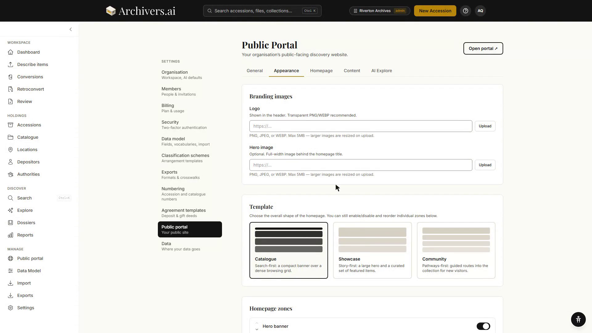
Portal templates
Choose from three homepage templates, each built for a different curatorial purpose:
- Catalogue — a discovery-focused template with faceted search, recent additions, and collection hierarchy.
- Showcase — a curator-focused template featuring selected highlights, featured items, and themed galleries.
- Community — an engagement-focused template emphasizing featured collections, announcements, and visitor access.
Choosing one sets the overall shape of the homepage; you can still switch individual zones on and off and reorder them afterwards.
Branding and colours
The Branding card on the General tab holds the text side of your identity; the images, colours and layout live on the Appearance tab (the General tab links across to it).
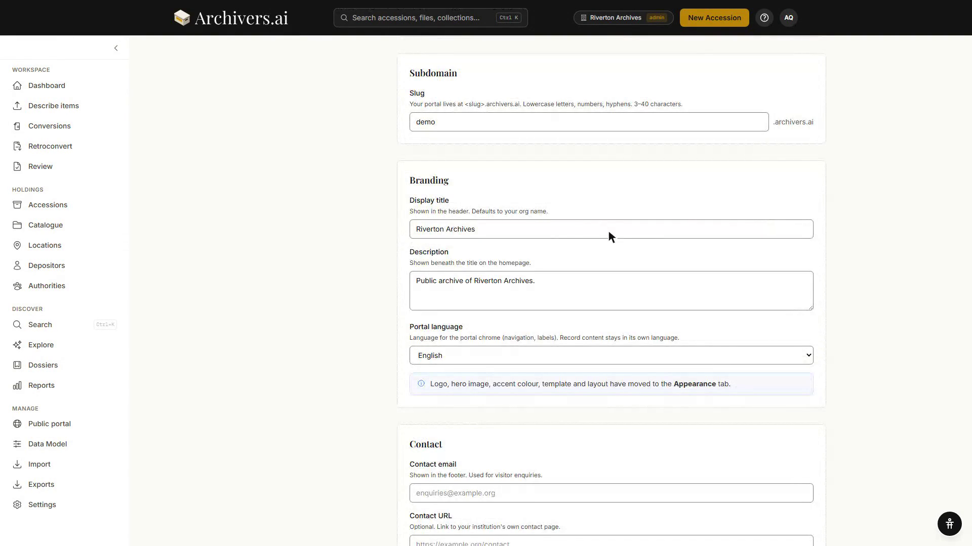
On the General tab, under Branding:
- Display title — shown in the header. Defaults to your organisation name if left blank. Up to 100 characters.
- Description — shown beneath the title on the homepage. Up to 500 characters.
- Portal language — the language used for the portal's own chrome (navigation, labels). Record content isn't translated by this setting; item titles, descriptions and catalogue text stay exactly as you wrote them.
On the Appearance tab, under Branding images:
- Logo — upload an image shown in the header. A transparent PNG or WebP is recommended.
- Hero image — optional, a full-width image behind the homepage title. The Hero focal point section below lets you choose which part of the image is kept in view when the viewport is narrow.
Under Colour & type:
- Accent colour — a hex code (e.g.
#B8860B) picked with the colour swatch or typed directly. - Secondary colour (optional) — derived automatically from the accent when you leave it empty. Clear puts it back.
- Neutral ground — the page's background family: Paper, Cool or White, each shown as a three-swatch ramp.
- Text scale — Small, Medium or Large.
- Density — Compact or Comfortable.
Under Search & browse results, Results view decides whether lists of items appear as a List or a Grid across the portal.
Accent validation
Whatever colour you pick, the platform derives an actual button colour that keeps text readable against it, to WCAG AA contrast standards. If your chosen shade had to be nudged, you'll see a note saying so: "We've adjusted this shade slightly on buttons so text stays readable (WCAG AA)."
Dark mode
Dark mode is a three-way choice, not a switch:
- Off (light only) — the portal is always light.
- Auto (follows visitor's system) — it follows whatever the visitor's device is set to.
- Toggle (visitor can switch) — the portal carries a control the visitor can use.
Live preview
The Live preview panel at the foot of the Appearance tab renders a specimen of the portal in your chosen colours and type, and lets you flip it between light and dark to see both.
Type presets
Choose from five curated pairings, each shown as a live specimen in its own faces:
- Reading Room — Source Serif 4 / Source Sans 3 (the default).
- Letterpress — Fraunces / Libre Franklin.
- Gallery — Archivo / Figtree.
- Documentary — IBM Plex Serif / IBM Plex Sans.
- Antiquarian — EB Garamond / Work Sans.
Zones
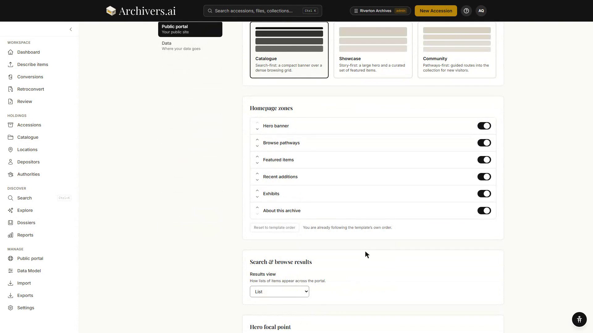
Zones are the sections of your homepage. Each template comes with a pre-set zone order, and you can reorder them or switch any of them off. There are six:
- Hero banner — your main image and title, with automatic statistics showing the number of published top-level collections, accessions, and items in your portal.
- Browse pathways — browsable category tiles (e.g. "Photographs", "Audio Recordings").
- Featured items — the accessions, fonds and dossiers you pick on the Homepage tab.
- Exhibits — your published dossiers, presented to visitors as themed exhibits.
- Recent additions — the most recently published items.
- About this archive — a text section describing your institution or collection.
Use the arrows beside each zone to move it up or down the page, and the toggle on the right to switch it off entirely. Reset to template order drops your custom order and follows the template again; it's disabled while you're already following the template.
Custom pages
Under the Content tab, Static pages gives you four fixed pages for your portal:
- About — tell visitors about your institution.
- Visit us — opening hours, location, contact information.
- Collections policy — explain your collecting scope and policies.
- Takedown policy — a dedicated page for takedown requests or rights concerns.
Each card shows where the page will live (<slug>.archivers.ai/about, and so on) and whether it is Published or Draft. Give it a title, write the body in Markdown, and tick Published (visible to visitors) when it's ready. The body is sanitised for security, so scripts and embed code are stripped.
Accessibility statement
Also on the Content tab. Use it to publish the accessibility statement your service needs to show, alongside the portal's own WCAG position.
Image display and watermarking
On the General tab, under Image display & watermarking:
- Watermark display images — off by default. When on, public images are watermarked at publish time.
- Watermark text — defaults to your organisation name when left empty.
- Max display image size — the longest edge, in pixels, for images served publicly.
- After changing these, use the regenerate button to refresh already-published images with the new setting — this can take a few minutes for large collections.
Audio and video playback
Toggle audio and video playback independently. Both also depend on a platform-wide switch — if that isn't on yet, your settings are saved and take effect automatically once it is. Turning these on means visitors can play files you've separately marked as publicly playable; you're confirming you hold the rights to stream that media publicly.
Search engine indexing
Allow search engines to index this portal is on by default — recommended so your collections are discoverable. Turn it off if you want the portal reachable only by direct link.
Homepage curation
Under the Homepage tab, choose what the portal's front page features. Pickers use your internal vocabulary (Dossiers, Fonds, Accessions) and only list already-published records:
- Featured Dossiers, Featured Fonds, Featured Accessions — tick up to 12 of each. The count beside the label says how many you've picked and tells you when you've hit the maximum.
- Latest additions to show — how many of the most recently published records to list (0–24). 0 hides the section.
- Intro copy override — optional text, up to 500 characters, that replaces the default homepage introduction.
Announcements and footer
Under the Content tab:
- Announcement banner — a message at the top of your portal. Set a tone (Info or Alert), optional show-from and show-until dates, and the message text; a preview shows how it will read.
- Footer — customise links, social media icons, opening hours, and address information displayed at the bottom of every page.